

#36 • Help pick a logo
#36 • Help pick a logo
A brand to stand next to...

You are reading 3Bits & Change, Joseph's email about building a direct to consumer business on the internet. Today’s email was written to a bad station Alexa chose, again. This time it was country something.

Good morning,
There is some debate about the value of branding among startup circles. Most believe that the brand ought not be worked on early. Like NO WORK on the brand.
“The minute a startup under $5m in rev starts talking to me about branding I already know the CEO has no idea what they should be focusing on” —Casey Allen
However, for those of us coming from the marketing world, it can easily be argued that a solid brand increases the likelihood of early growth where trust is key to the product/service and opens doors to partnerships and channel plays. The later is the approach we’re taking with Vivront. We respect what we’re doing, it’s quality, and we want to express that in our mark (e.g. our visual shortcut to trust).
The first Vivront mark was created in a few hours with a type driven approach. My view is that if a word is not widely known a brand can more easily define what the word means to people through its actions. Vivront is a solid name for a social oriented company in that it refers to a future state of being made whole, of living in a plural, in native French. It’s a good name for a social oriented kitchen knife company too. It even has two “v” characters in it! How many words have two sharp v’s in them?However, I took the very uncreative approach to making the first logo mark. I added another V and dropped it in a circle. Ha.
I knew it was time to get a new mark when 1) I did not want to print that logo on the side of a knife, an apron, a hat, etc. and 2) When I did not see that mark pairing well with our prospective partner brands at a national scale.
So, we engaged an agency to help with the process. Debatably I should have spent that cash on a physical retail space. However, none of those are available, so far. Not even today. So, we keep looking and sharpening out of our current configuration.
To get things started with the design process, I handed over all the base documentation and research on the kitchen knife sharpening industry as well as the brand foundations we’re building upon and store research, etc. Then… I sat on my hands… for 3+ weeks. I heard nothing from the agency, that’s a bummer and one I’ll talk to them about, and hoped every day that what got made was going to be awesome.
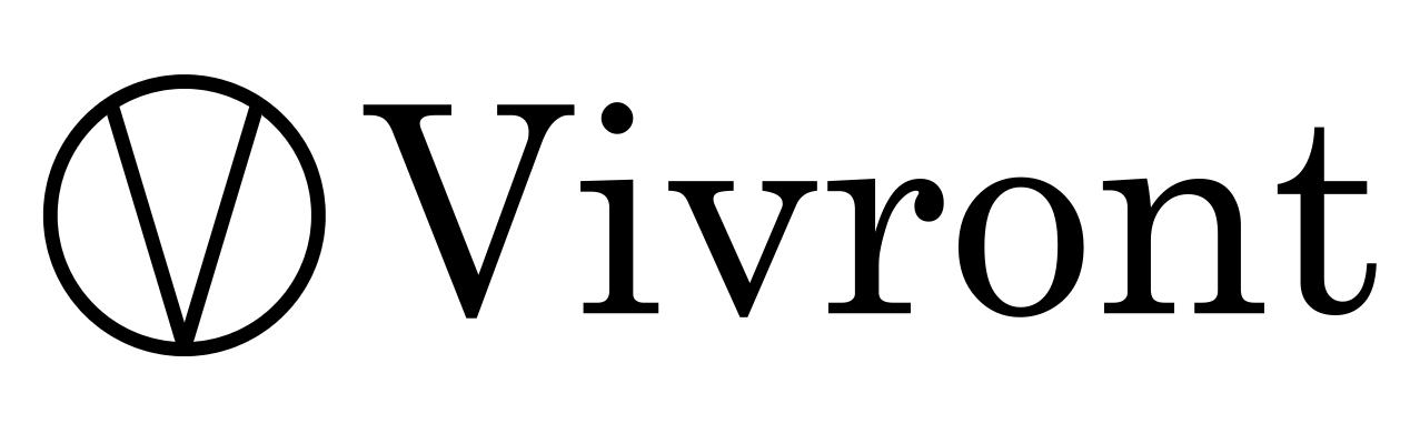
Please take a peek at the finalists after the first round.
Hit reply and let me know your thoughts.
Bit #1
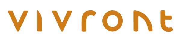
Bit #2
Bit #3
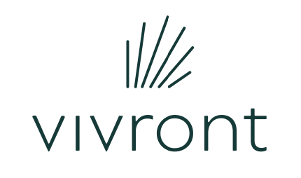
Sum
We have things we like about each of these. We’ll have to say no to two and select one to advance with.
Which do you think we should pursue further? Why? Hit reply!
Follow Vivront.com on TikTok, Instagram and Facebook.
Follow @josephrueter on Instagram or Linkedin.
Order kitchen knives sharpened or give the gift of sharp at Vivront.com.
#3 is the cleanest. I get the knife in the first V on #2, but the font looks like a dark wool kite Jen from the late 70s. Maybe 2 would work with a cleaner font. I think I get #1 but not a contender